Tuesday, November 16, 2010

Chilidawg & Naranjito

This is a mock comic book cover that I did for a couple of friends who are rooming together. The names are my friends' actual nicknames and it's full of inside jokes and stuff. These characters would make ATHF look like Sesame Street..


- P

Friday, November 5, 2010

To infinity...

Here's a step by step of the Buzz Lightyear piece I did for Pixar Times Blog.

The rough sketch. I don't know what happened but these white blocks appeared on there out of nowhere.. My Photoshop took a shit or something.


Line art.


Flats.


Added light source and highlights.


Added the helmet and the stars in the background.


Switched some colors to spice up the contrast and added a trail of fire for the jet pack.


Added a few more details, mostly glow effects here and there.

-P

Thursday, September 9, 2010

Tetsuoooo


A little work in progress of a personal piece I'm working on.
Late!

P

Wednesday, July 21, 2010

Virgin America Airlines


A few years ago I was hired to draw the illustrations for the Virgin America Airlines safety card. It was an awesome project to work on and I was very pleased with the outcome.

This is what I worked on -


I never got my hands on an actual, physical safety card. A coworker of mine said she was going on vacation and was going to fly on Virgin America, so I told her to bring me one of the safety cards since I never got one for myself.

To my surprise, this is what she came back with -


What the hell is this??

Fuck me, they redrew my illustrations with some whacked out colors and added that lovely blue gradient in the background. I don't know why they did this, but I'm really disappointed. And bitter, if you can't tell...

Here are some side by side comparisons -


The whole point of this card was to keep it different from all the other airlines and be hip and modern. But now the safety card looks like all the other outdated, generic cards out there.

PS. Whoever did the Spanish translation on the front of the new card needs to learn how to use the space bar.

Oh yeah, fuck you VA :)

-Pac

Thursday, July 15, 2010

Digital Artist Magazine


http://www.digitalartistdaily.com/

I was featured in this magazine at the beginning of the year and have gotten to work on a few tutorial commissions for them. Issue #9 is available right now and this is the piece that I did for it. It's about using Photoshop filters creatively.


Here are some of the other illustrations/tutorials that I've worked on in past issues.


Tuesday, May 25, 2010

Introducing...Vol.2 Book Promo


When you order the book now you get a free print from Danimation!
Go over to Vegamation to order :]

-Pac

Friday, March 26, 2010

My Dunny Collection...

..is getting out of hand. I need something to stand them on and of course, another glass case. I officially ran out of space.


There are still a few that I'm missing that I really want. Must...resist buying some...more.
This shit's addictive. For real.. You're better off without them , give them to me :]

-Pac

Friday, March 5, 2010

Introducing...Vol.2 Book

You can preorder Introducing...Vol.2 now!! By Vegamation Press.


The book consists of new art by Jeff Wamester, Jenny Frison, Danimation, Justin Copeland and myself.

Here's a little preview of my stuff -


8x10
45 Full Color Pages
Perfect Bound
Full Color Glossy Cover
More info here.

I've seen the stuff in there and it's amazing. You won't be disappointed!

-Pac

The Art of Jorge Vargas


Check out my boy Jorge Vargas' art for some cool ish here and here.

-Pac

Wednesday, March 3, 2010

Wif Mah Rohbawt - Color Process

So I got to collaborate with Joseph Arruda on this awesome piece that he drew. I've been following his work for years and it's truly an honor to get to work with him. Go check out his stuff here. This is a color process of what I did in Photoshop.

This is the line art by Joseph = awesome.


First I just lay down the flats. I usually use muted colors to work as a mid tone.


On this step I added shadows on the ground, picked a background color and whitened some of the line art on certain spots. I also created a copy of the flats and blurred it to give it a very subtle dark 'glow' around the characters and moved it under the flats layer.


Here I started with highlights using a soft brush, picking a light source coming from the top. Also added a lighter color to the ground and just played around with a textured brush for the background.


More highlights to the rest of the characters and added some shadows as well.


Now it just consists of adding more details everywhere. Added yellow lights coming from different parts of the robot, some red reflecting off the glass surrounding the robot's head, brighter highlights on certain spots and subtle lighter colors on the darkest parts.


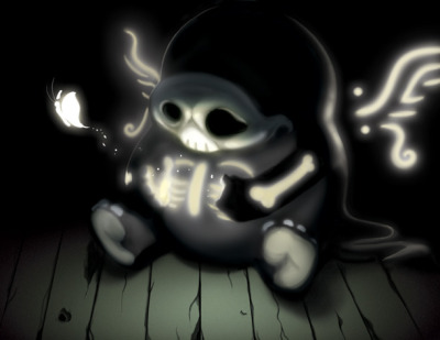
And this is the final which consisted on adding details to the light reflecting off the glass, and making the robot look like it's been through some rough times by adding dents, scratches and rust all over the place.


-Pac

Monday, March 1, 2010

IdN Extra 02: Neo York


There's a book out now by IdN called Neo York in which artists were asked to illustrate New York City in the future. My 'Cab Ride on Autopilot' piece is featured in there along with some awesome pieces by very talented artists. Pick up your copy today for only $25.

My profile page can be seen here.

Saturday, February 20, 2010